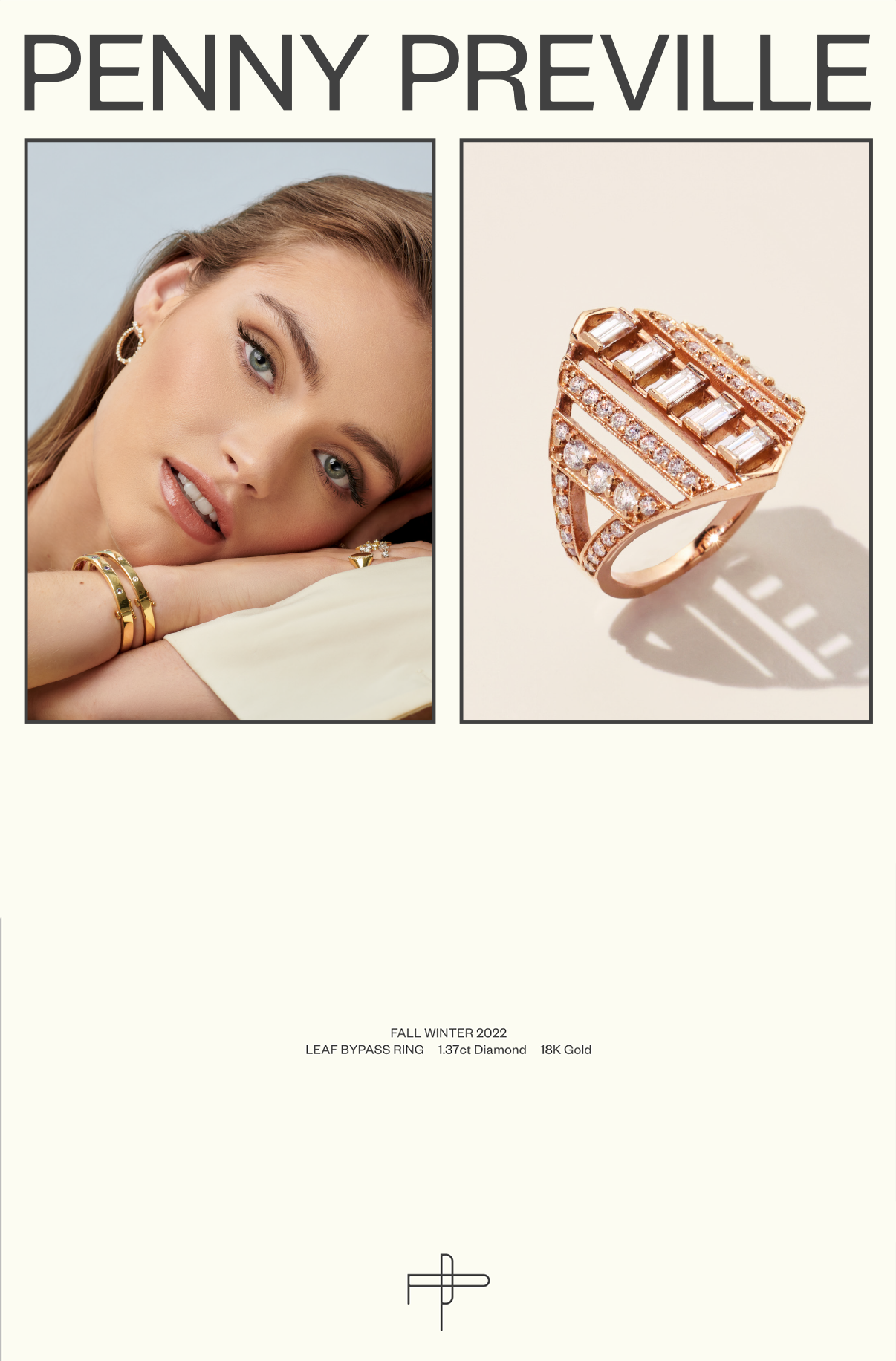
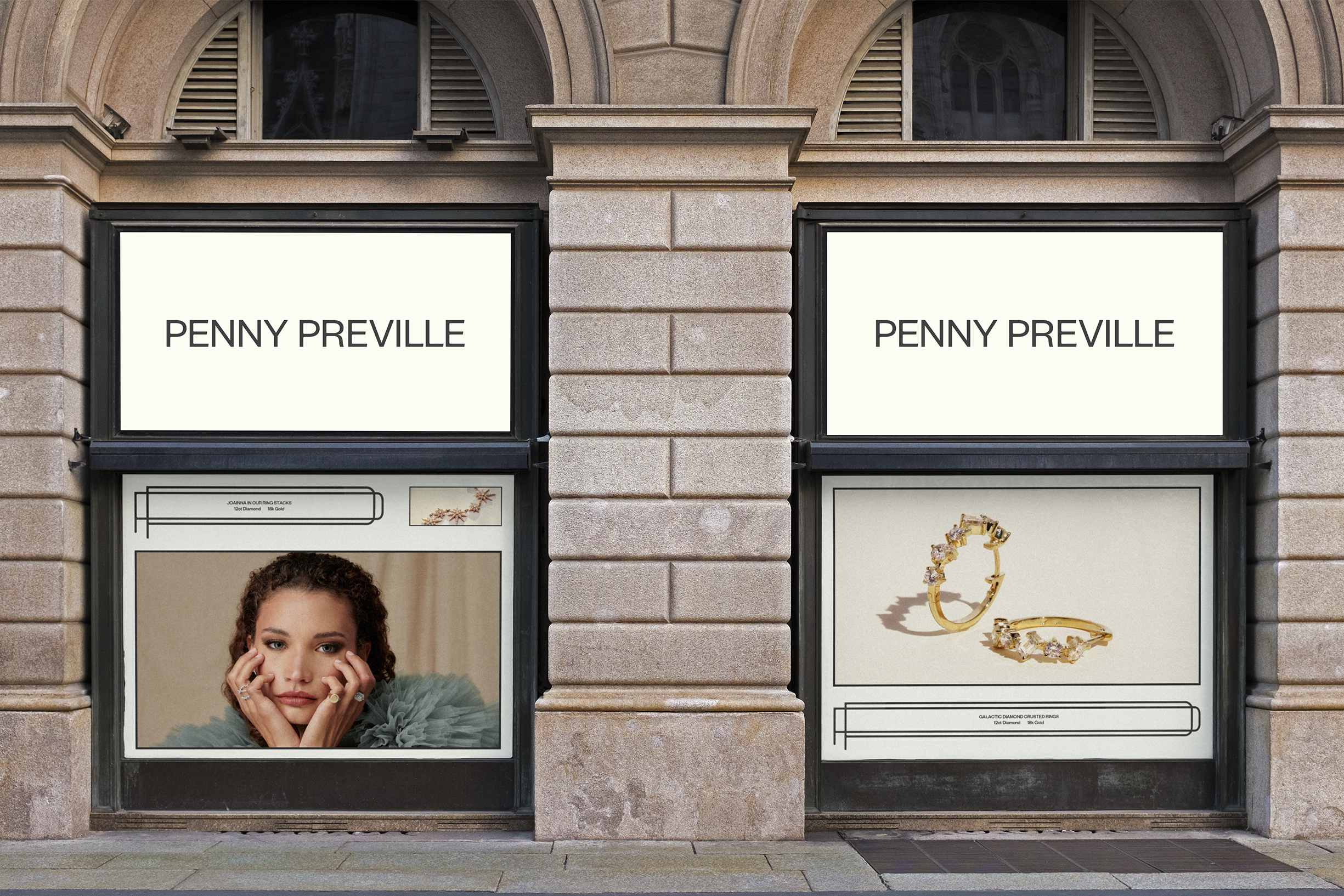
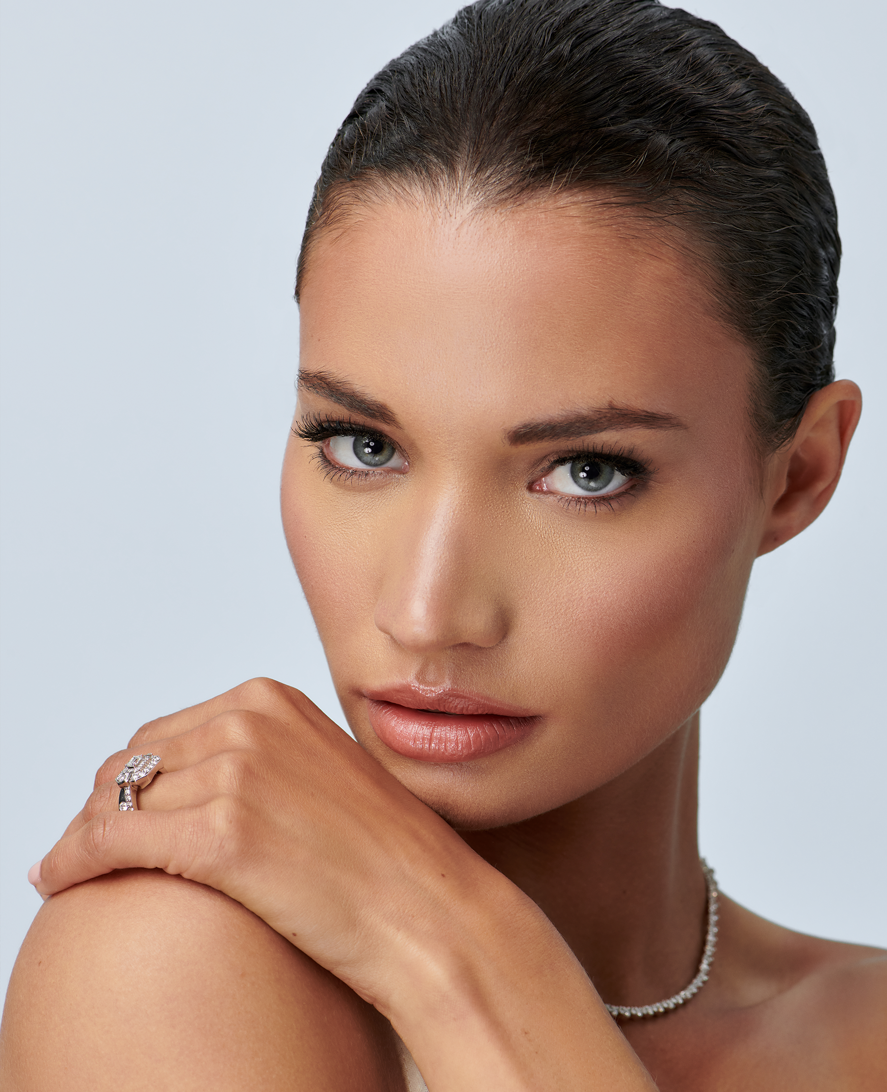
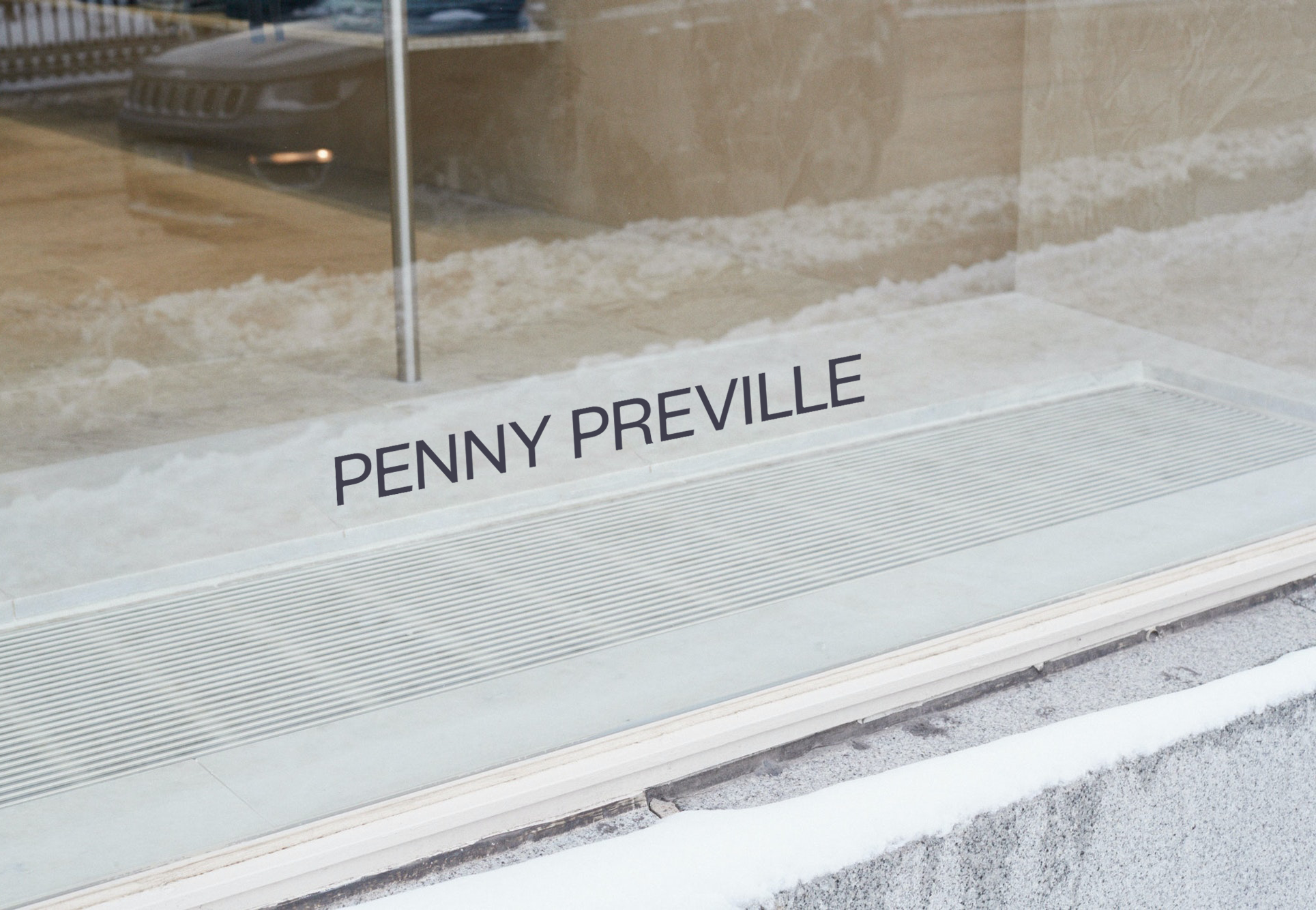
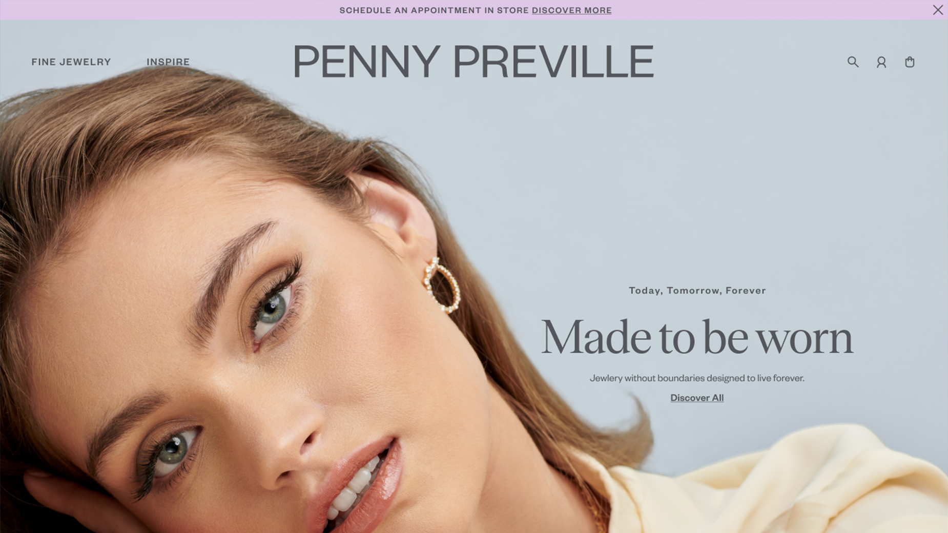
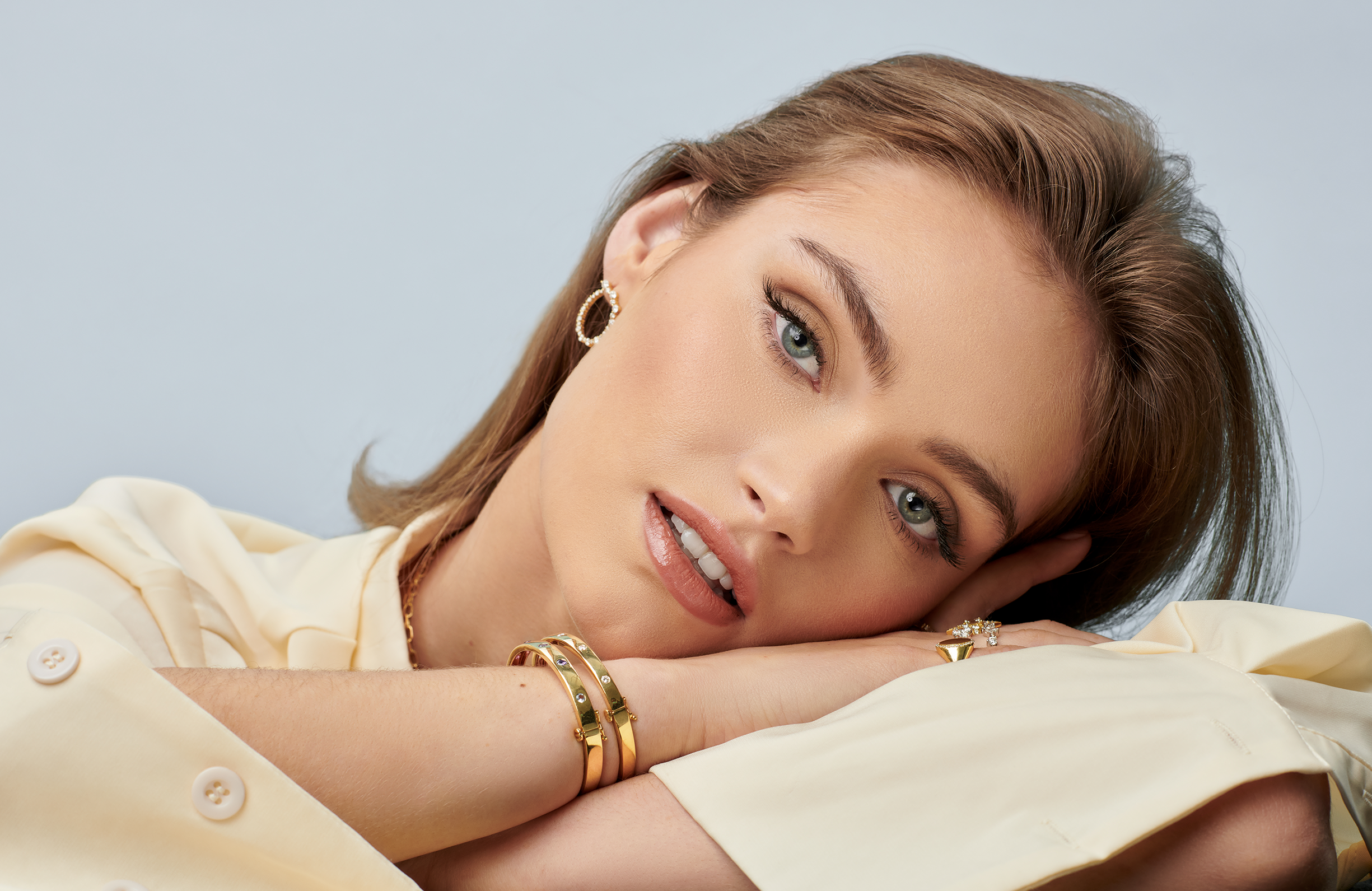
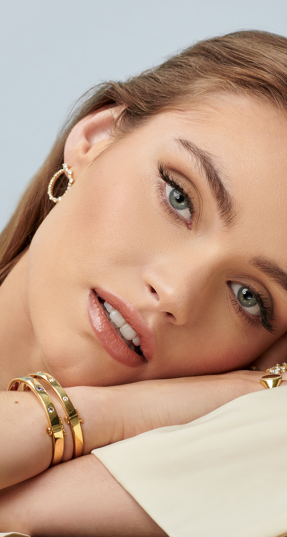
Penny Preville

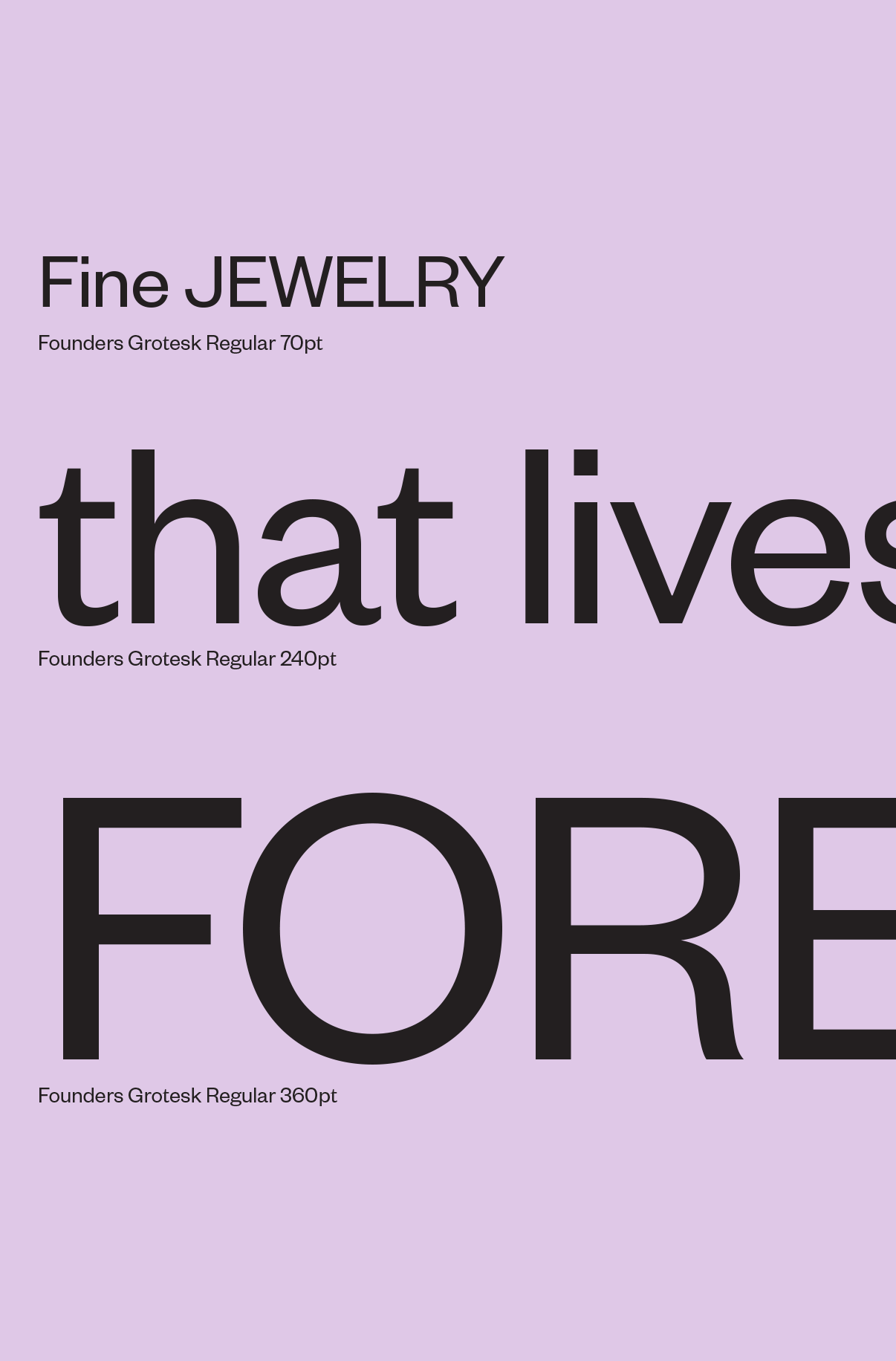
Today, tomorrow, forever

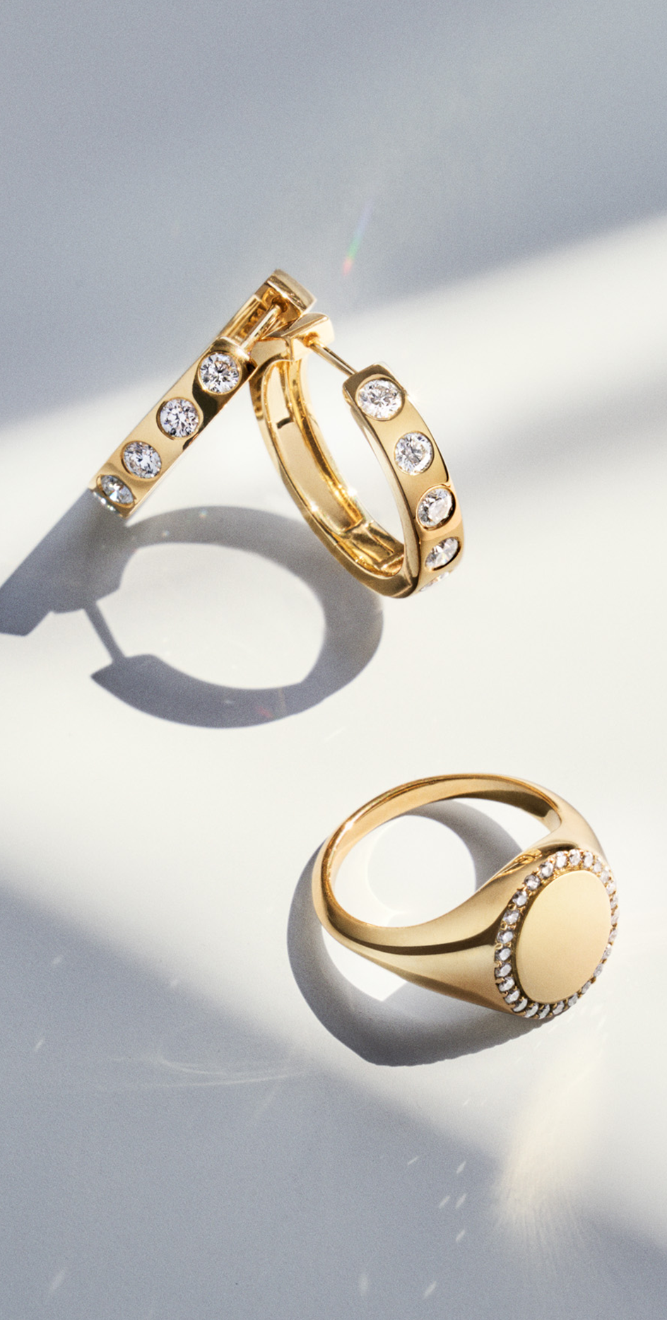
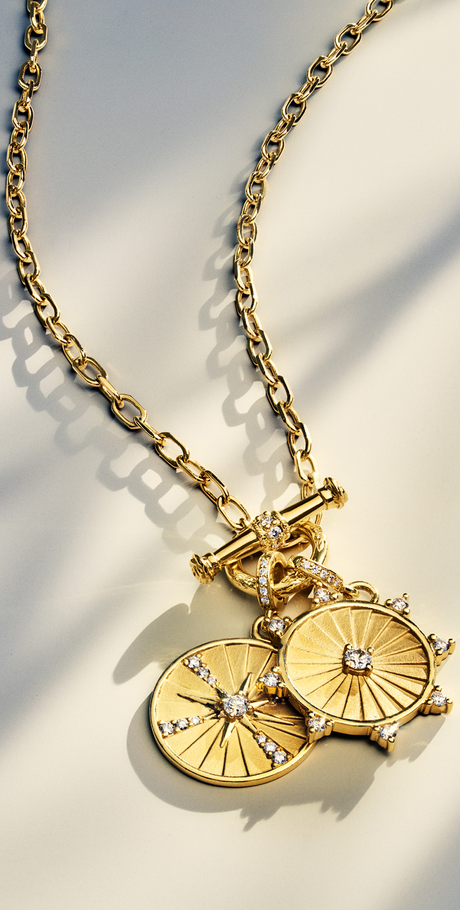
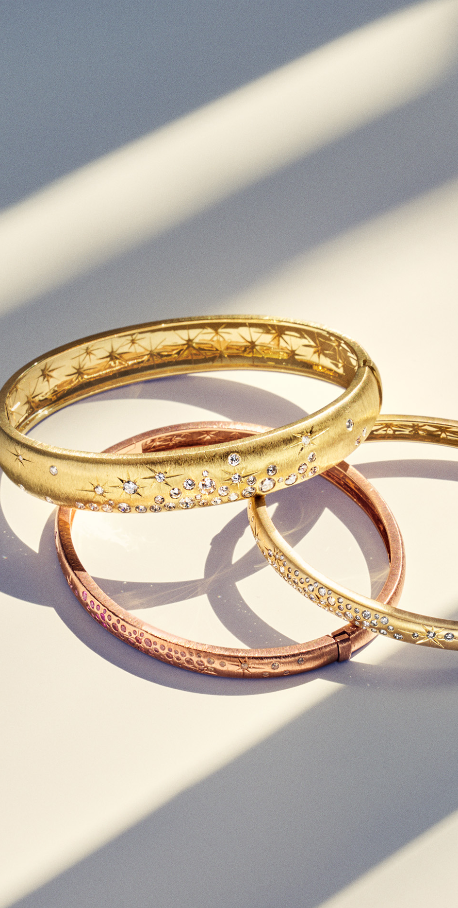
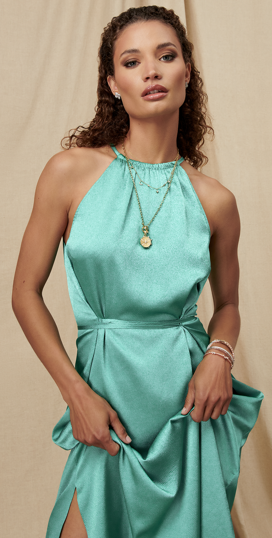
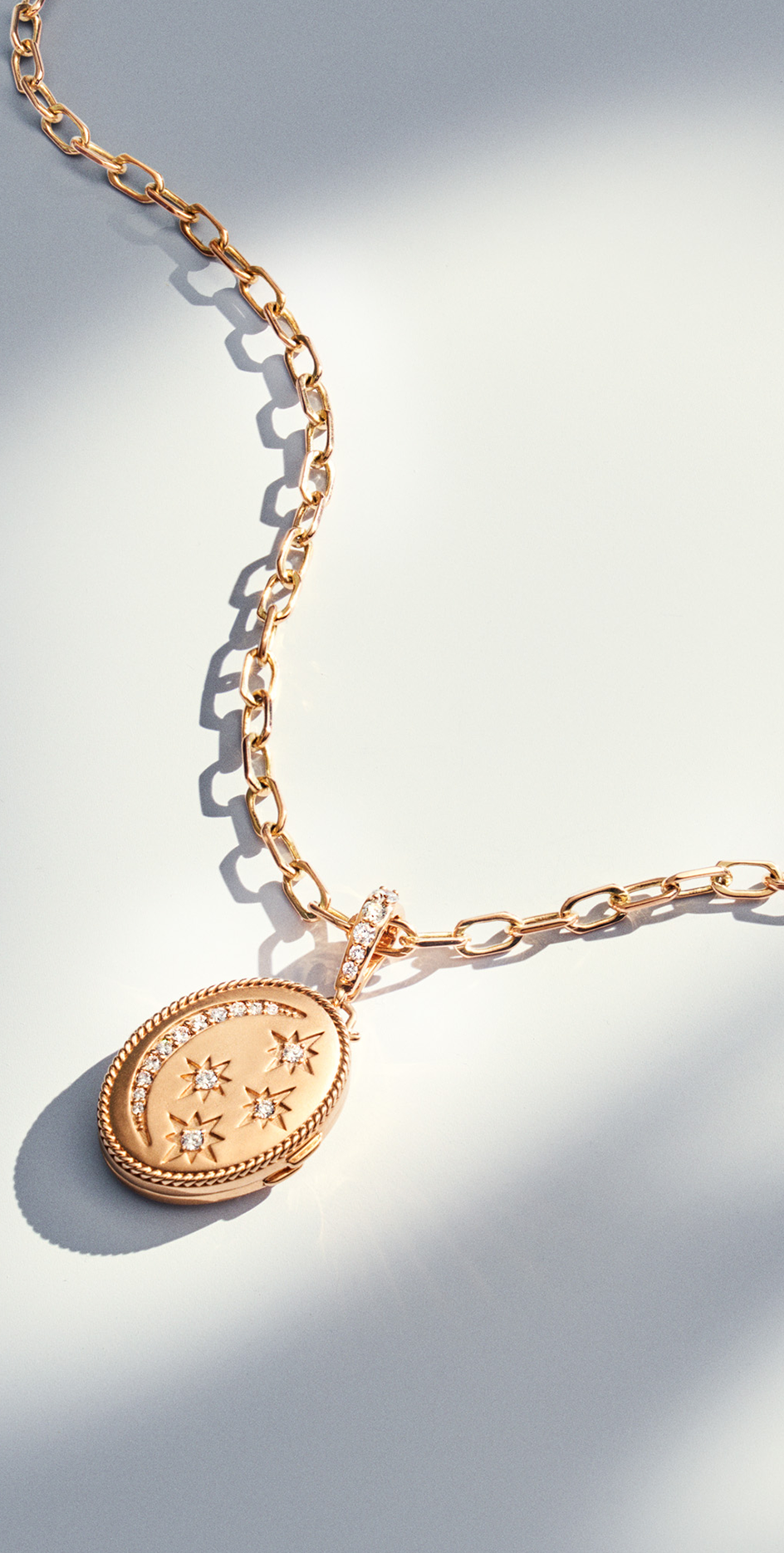
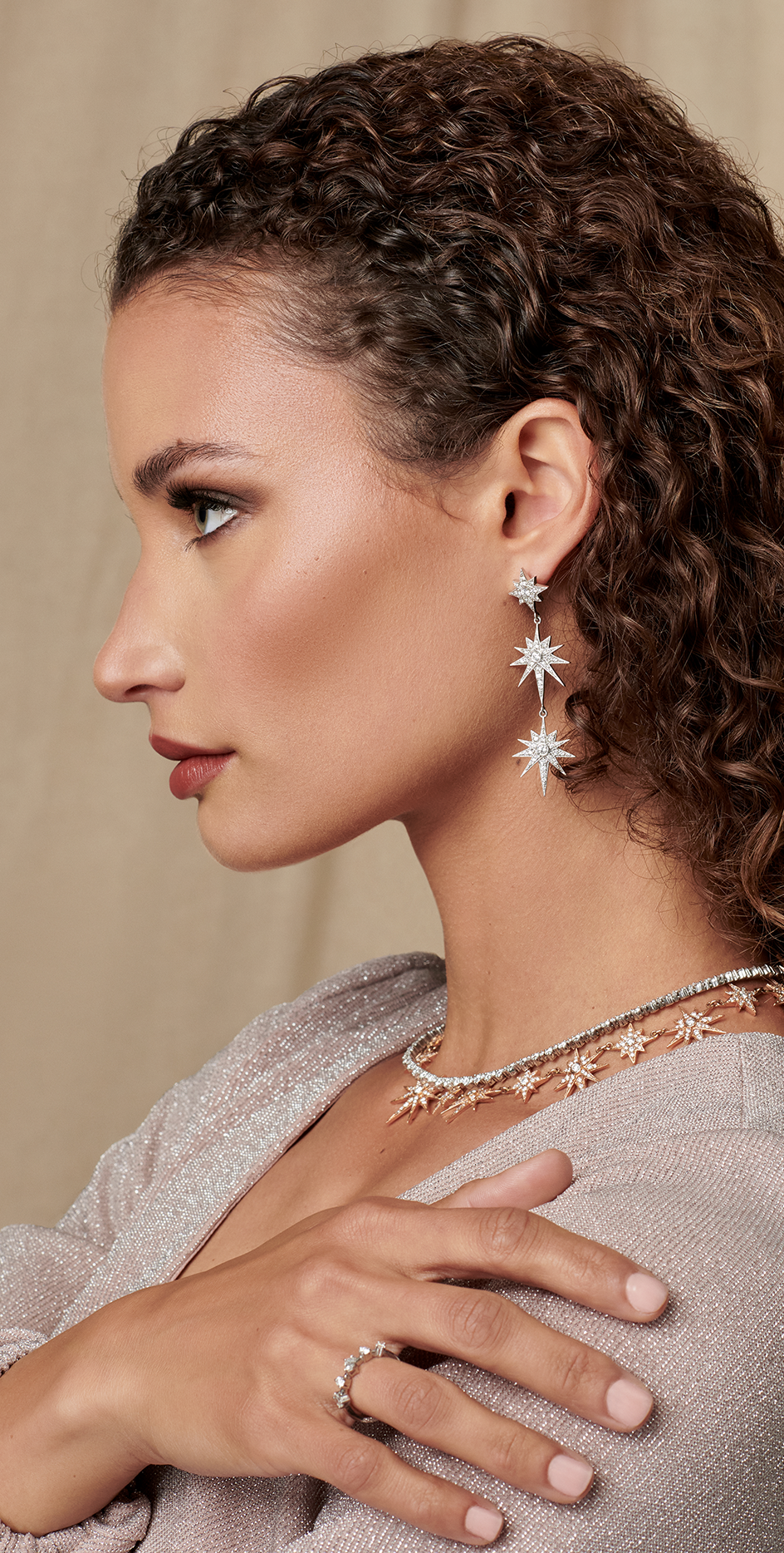
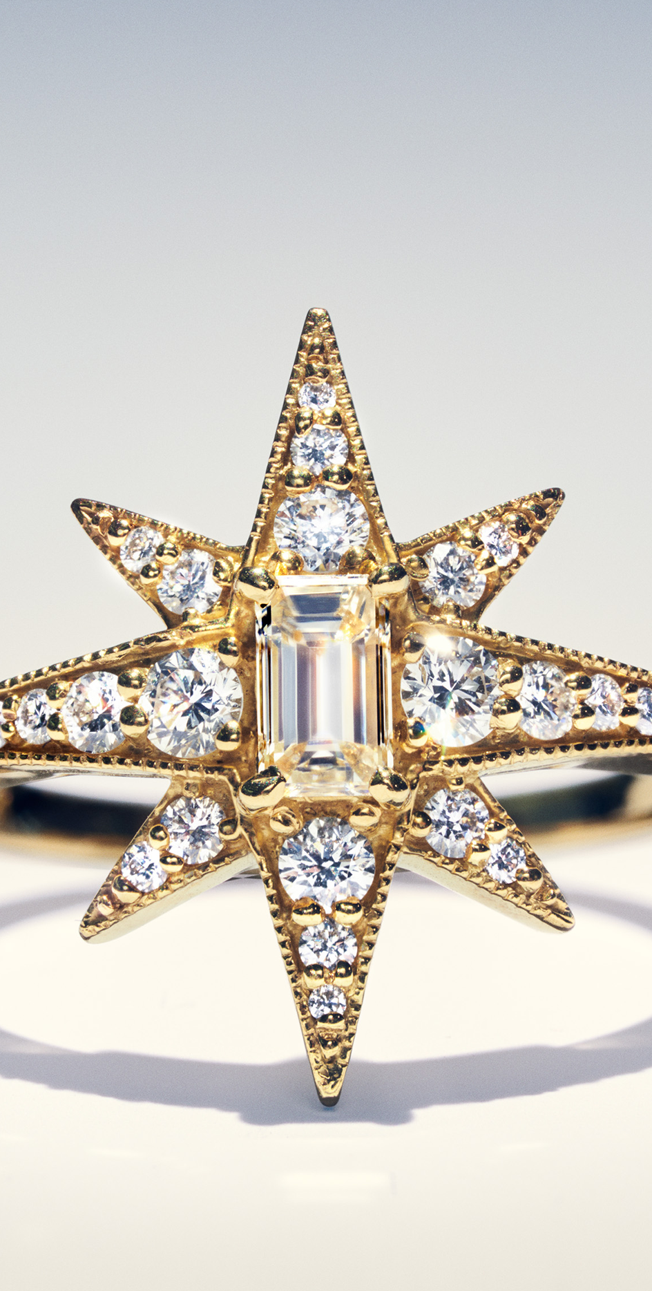
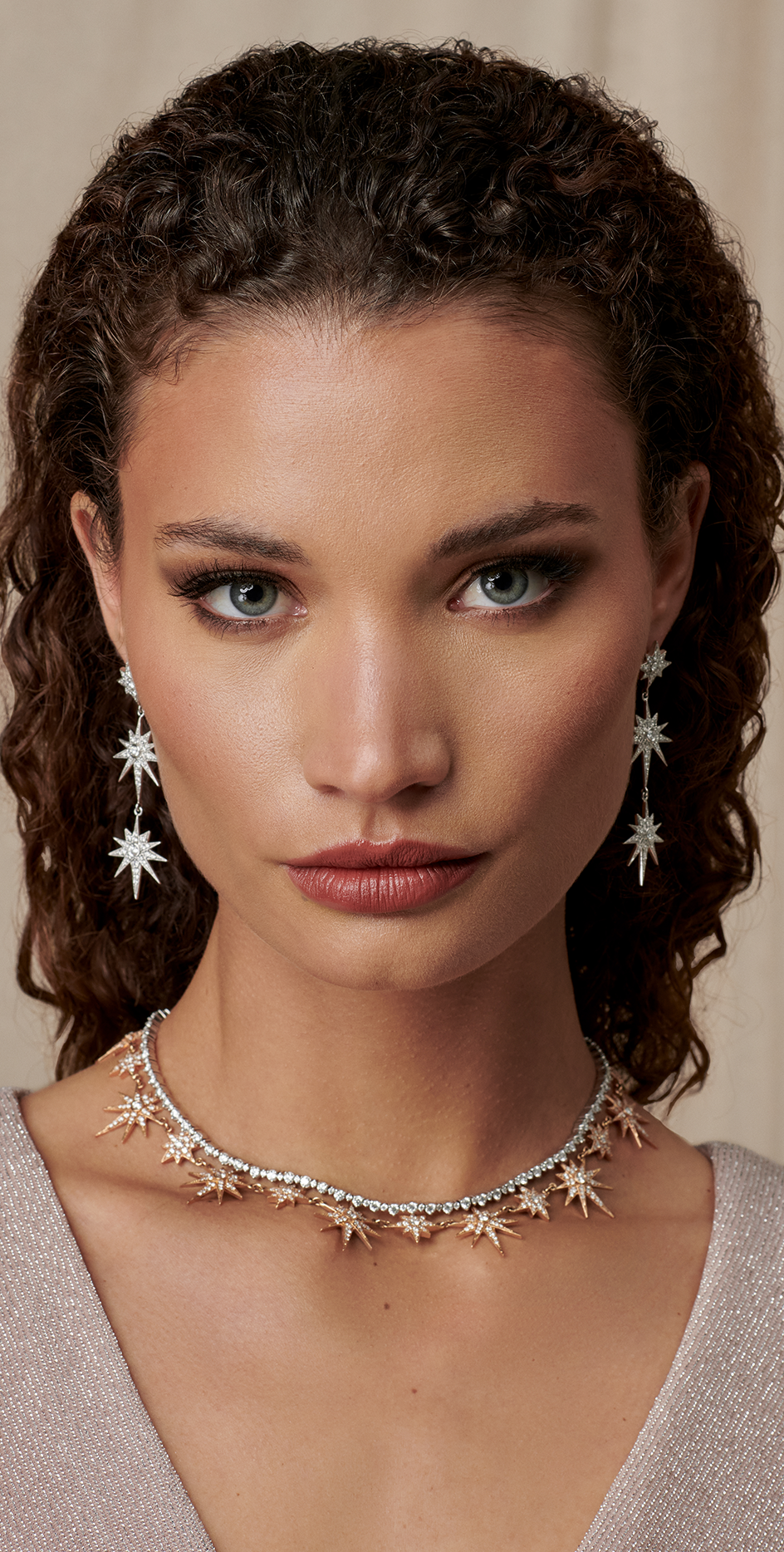
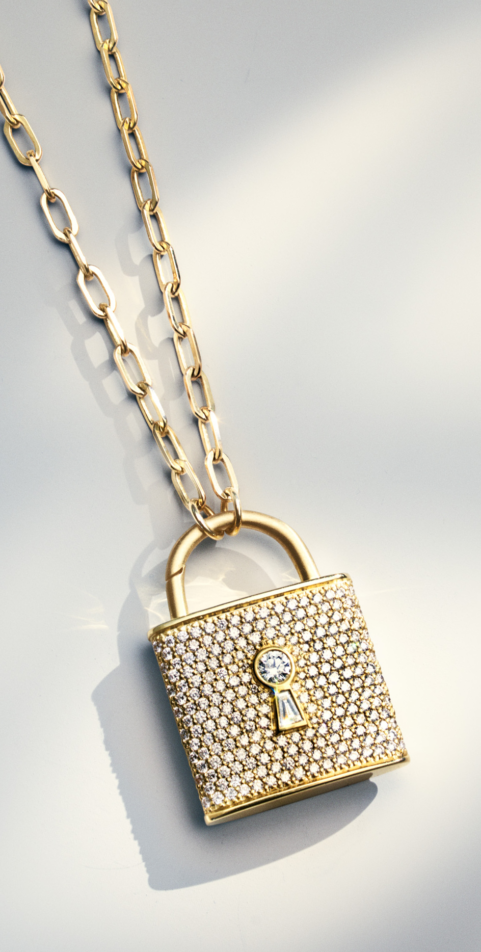
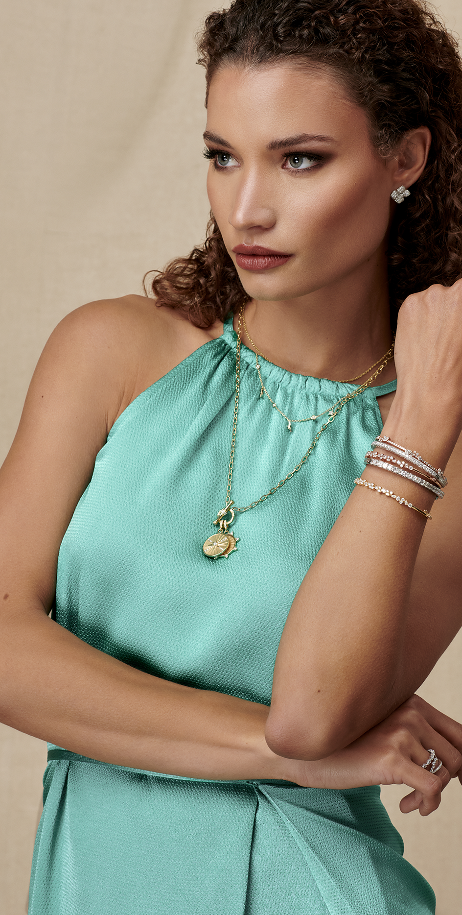
Penny Preville is a luxury jewelry brand designed to be worn without boundaries. Made for whatever life brings, it is perfect for everyday occasions and your most cherished moments. Saleah collaborated with the Penny team to reinvigorate their verbal and visual identity to speak to the next generation of heirloom jewelry customers.

Luxury Fine Jewelry

CHALLENGE

A pioneer in the woman-owned jewelry space for 40 years, Penny desired a transformation that aligned their timeless jewelry with a new target audience: millennials. They faced the industry-wide challenge of adapting a legacy brand to the digital age and its omnichannel experiences, so we created an identity that felt like home while speaking to a younger generation.

THE OUTCOME

As one of the first woman-owned fine jewelry brands, Penny Preville has spent half a century earning women’s trust and loyalty, so we knew we were building on a solid foundation. Penny’s jewelry is luxurious and intricate, yet versatile in wearability. Whether it’s 18k gold, platinum, or diamonds and gemstones, Penny makes cherished pieces you can wear while getting groceries or going out to dinner. Penny’s approach is modern, so their brand needed to be, too.

For generations, luxury jewelry brands have marketed to men shopping for women, but we felt it was time to flip the script and focus on the self-purchasing woman. We built a brand narrative that celebrates women’s wins—a new accomplishment, personal style, independence, an engagement, a promotion, you name it. No matter the cause for celebration, Penny celebrates with you.

Jewelry Without
Boundaries

Penny Preville jewelry is made to be worn yet designed to live forever.

IDENTITY

Penny Preville had never adopted a brand identity before, so uniting their new story with a fresh visual aesthetic was vital. The logo concept formed a union of the two letters “PP” using the abstract design of an earring chain. To show the versatility and dynamism of the jewelry, the logo changes in scale through motion design. We used a pastel blue, purple, and cream color palette to create a youthful energy and paired it with a minimalist design to allow for soft product expression.

It was important that the brand feel relatable as fine jewelry brands are traditionally unattainable and heavily distance themselves from young consumers. We left that “look but don’t touch” ethos behind and embraced approachable luxury that removes boundaries between the customers and the brand.

MISSION

To design jewelry of exceptional quality for women to adorn — timeless yet modern jewelry that embodies the heirloom but is made for life — without boundaries.

PHOTOSHOOT

We commissioned John Jay to photograph the Penny Preville campaign. To ensure the jewelry felt relatable to everyday life, we cast two models of different age ranges and ethnicities and styled them both casually and chic. We shot in-studio with pastel and neutral backgrounds and on textures and gradients to create product shots with soft shadows.

Thank you to our incredible team for the time and care you gave to this project. Together, we make things shake for our clients, so we’re giving you your flowers! We appreciate your fantastic work and are grateful for your commitment, self-motivation, and talent that truly inspired us all.

Creative Direction:
Shar Biggers

Brand Strategy:
Shar Biggers

Verbal Identity:
Delesia Watson

Design:
Jorge Leon
Mikel Romero

Photographer:
John Jay

Models:
Rebekah Allred
Rebecca Deering

Casting:
Shar Biggers

Production Crew:
Jill Taymany
Shar Biggers
Tori M
Andrew Chen
Justin Lynn

Art Dept:
Nick De La Rosa

Show more Show less

There’s more where
That came from.